How Elizabeth-Mary Olowolabi's First Year in UI/UX Design Changed the Way She Thinks
Key Takeaways
- •UI/UX designer Elizabeth-Mary Olowolabi, founder of the product studio Silhoh, attributes her early design failures to prioritizing visual polish over user needs her first year in the field.
- •Her key early mistakes included designing individual screens in isolation, skipping the problem-definition phase, assuming aesthetics equaled usability, and spending more time mastering Figma than developing design thinking.
- •Her current workflow begins by defining what problem is being solved and for whom, replaces isolated screen design with full user flows, and emphasizes clarity, usability, and early critical feedback.
- •She is now applying these lessons at Silhoh, which is exploring digital products that support meaningful connection, mental health, and remote care, with a focus on accessibility and testing ideas with potential users.
- •Her experience reflects a broader industry gap in which usability testing and standards like the Web Content Accessibility Guidelines measure qualities that visual polish alone cannot satisfy.
The technology industry is heavily saturated with polished digital products that almost no one wants to use. For early-stage designers and product founders, the allure of a pixel-perfect interface often masks a fundamental structural flaw: a screen can look flawless on the canvas yet collapse completely when placed in the hands of an actual user trying to solve a real problem.
UI/UX designer Elizabeth-Mary Olowolabi, who is currently building Silhoh, a product studio, spent her first year in design falling into exactly that trap. Starting out in the field often feels like a steep technical climb, and the initial assumption is that mastering tools like Figma will automatically translate into designing great products. Olowolabi quickly discovered that the software is the easy part. The real difficulty lies in restructuring how one thinks about user behaviour.
"My early work failed in ways I only understand now because back then it looked visually acceptable," Olowolabi said, reflecting on her entry into the field in an interview with TechNext24.
Her foundational mistake is a common one across the technology ecosystem. She assumed that UI/UX design was primarily an exercise in ensuring interfaces looked clean, and that misunderstanding dictated her entire approach during that critical first year.
Designing Screens Instead of Systems
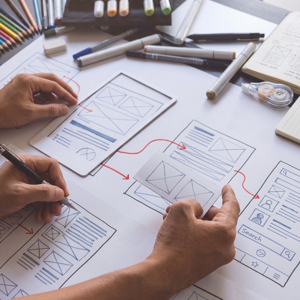
One of the most persistent errors amateur designers make is treating a digital product as a gallery of isolated images. Olowolabi found herself hyper-focusing on individual screens instead of mapping out the overarching user flow. She would meticulously craft the layout of a single page in total isolation, paying little attention to how users actually moved from point to point B. It felt natural at the time, because the prevailing — albeit flawed — logic suggested that good design simply meant well-crafted visuals.
Interfaces, however, do not exist in a vacuum. Digital products are ecosystems, and UI/UX is fundamentally about how different touchpoints connect to form a seamless, frictionless experience. When a designer focuses purely on the aesthetics of a single page, the connective tissue of the product begins to fray.
Olowolabi soon began noticing glaring gaps in her deliverables. Steps did not flow logically, transitions felt disconnected, and core actions were buried or unclear. The entire user experience felt fragmented and disjointed. While disconcerting, the realisation forced a necessary reckoning: UI/UX design relies on engineering the relationships between screens rather than decorating the screens themselves. Shifting from thinking about static pages to thinking about dynamic systems completely altered her professional trajectory.
Skipping the Problem
That systemic failure traced back to another critical misstep: skipping the problem definition phase entirely. The rush to create is a powerful force. Before grasping the actual problem a product was supposed to solve, Olowolabi would already be deep into a Figma file, generating interfaces for a loosely defined concept. The inevitable result was a polished design that addressed no clear user need.
Strong product work happens long before a design tool is ever opened. No matter how visually striking a solution might be, it remains structurally weak if the underlying problem is ambiguous. It is a discipline embedded in mainstream product practice: widely used frameworks such as the Design Council's Double Diamond place discovering and defining a problem ahead of developing and delivering solutions. Today, her workflow has been completely inverted. Defining the problem is the non-negotiable first step, and before laying down a single component she forces herself to answer two foundational questions: what problem is being solved, and who exactly is it being solved for?
Aesthetics Are Not Usability
For a long time, the industry has conflated aesthetics with usability. Olowolabi operated under the assumption that a visually polished interface automatically equated to a good user experience — that as long as a design looked modern, it was inherently effective. It took time to unlearn that mantra and realise that users do not experience design purely as a visual medium. They experience it as a measure of ease or difficulty in completing the specific action they are attempting. A brutally simple, perhaps even plain, interface can feel incredibly intuitive and efficient, whereas a visually stunning dashboard can remain entirely unusable. That distinction helped her understand the difference between making an interface look good and designing an experience that works well. Visual design is undeniably important, but it is only the surface layer of a much deeper functional experience. That gap between looking good and working well is one the industry has institutionalised: usability testing measures whether people can actually complete tasks, while accessibility standards such as the Web Content Accessibility Guidelines set measurable requirements for contrast, navigation and operability that visual polish alone cannot satisfy.
Tools Over Thinking
The aesthetic fixation fed another common mistake: focusing too much on design tools. Beginners often spend an inordinate amount of time learning the intricacies of design software rather than developing their design thinking. Olowolabi poured hours into mastering Figma features, plugins and shortcuts, convinced the technical skills would elevate her status as a designer. Technical proficiency is useful, but her decision-making skills were lagging far behind. Software cannot tell a designer whether an idea is solving the right problem, and without a rigorous understanding of user goals, human psychology, context and technical constraints, software skills are virtually useless.
The moment Olowolabi stopped obsessing over what she could create and started questioning why she was creating it, the quality of her work shifted. "When I stopped asking myself 'What should this screen look like?' and started asking 'What problem am I solving and for whom?', I began focusing more on context, goals and users before considering visuals," she said. Instead of rushing toward a finished interface, she became focused on understanding what that interface would actually help a human being accomplish.
A Rebuilt Process
Her approach today is unrecognisable from her first year. Understanding the problem precedes everything. Designing in user flows has replaced designing in silos, and clarity and usability consistently trump visual appeal. Crucially, she now seeks critical feedback early in the process rather than waiting to present a finished, unvalidated masterpiece. Projects now feel intentional because they are guided by rigorous problem-solving rather than subjective aesthetics.
Those hard-won lessons are now the driving force behind Silhoh, the product studio she is building. Olowolabi is applying the principles as she explores how digital products can support meaningful connections, improve mental health and deliver better experiences in remote care — contexts in which unclear or difficult-to-use interfaces can create unnecessary friction for people trying to access information, support or care. As Silhoh develops in its early stages, she is focusing on understanding users, accessibility and testing ideas with potential users, with the primary objective of exploring what makes digital experiences genuinely useful, accessible and easy to navigate.
In her view, most early-career mistakes stem from a distinct lack of context. It is easy to spend hours debating colour palettes and button components because those are variables a designer can immediately control and see. The actual heavy lifting requires stepping away from the screen to understand the messy, complex human journey happening on the other side of the interface.
Olowolabi's evolution points to a broader conclusion about the technology sector: the real skill is not creating perfect screens. It is completely understanding the business, the problem and the human being those screens are built to serve.